
Microinteractions in SwiftUI - Menu Button Animation
Microinteractions have become increasingly important in a world with a dizzying number of digital platforms and an ocean of content. While microinteractions used to be considered an interesting resource in the early days of digital design, in today’s hypercompetitive digital space they have become a crucial element in the overall user experience.
Basically, microinteraction is a particular moment of a user’s interaction with a product in order to complete a specific task. For example, when someone presses a “Like” button (whatever it looks like) and sees that their action produced a feedback - the number has changed, the color of the button has changed or it has become inactive, the text on the button reported that the action was done and so on - this is a case of microinteraction.
In this article, I will show you how I implemented a menu button microinteraction in SwiftUI.
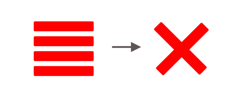
The idea is to present a menu button with 4 horizontal lines, and, when the user taps on the button, it animates into an ‘x’ shape, to represent the option of closing the menu.
I began with an empty project, enabling SwiftUI. Then I created a file with two views, like this:
I defined a fixed frame for it, and for my purposes it can be a square shaped button. There’s a state property isAnimating, that the animations will respond to.
For the button body the action is simply to toggle the isAnimating property, and its label closure calls the createMenu method. Let’s take a look at it.
There’s a lot going on here, but I’ll break it down. First, the method returns a type eraser view AnyView, and contains two properties, the count, which is the number of rows for the button, and the configuration of the menu.
In menu the geometry reader is used, so that we can access the width and height we have available, and, therefore, calculate the properties we need. So, 4 views are grouped, and we calculate availableHeight, spacing, height and width.
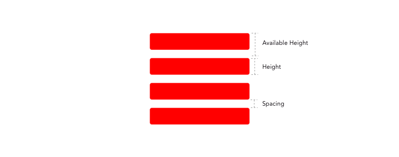
Then, the rectangles are created with the height and width, and we can finally configure them. Each rectangle is overlapping the other ones, so we’ll use the offset modifier and multiply the index by the available height. This way they get positioned correctly along the y axis.
Then I configured the animations, which are custom modifiers. I’ll get to them in a second. Finally I used the animation modifier, with a small delay and the easeInOut option, and return the menu.
Configuring the Animations
The MiddleMenuRect is a custom modifier that handles the second and third rectangles (index ‘1’ and ‘2’). Both of them need to rotate, on opposite directions.
Here’s how the code look like:
In the body function, two modifiers are being called: rotate and offset. That’s because when the rect is rotated there’s a slight difference in position, so they need to me adjusted in order to form the ‘x’.
The modifiers return a value based on a condition of being the middle indexes and the isAnimating boolean.
For the MarginMenuRect the setup is very similar, but this time, the first and last indexes are placed as conditions and the modifiers opacity and offset are applied. While the rectangles are moved through the ‘x’ axis in different directions, the opacity is reduced, giving the idea that they were ‘removed’. Check out the code:
For better readability, the MiddleMenuRect and the MarginMenuRect view modifiers were added to an extension:
That’s it! We have a nice menu button, that when tapped turns into an ‘x’. Here’s how it looks in action:
Nice, isn’t it?
Conclusion
Utilising microinteractions can enrich usability. The features of an app attract a user to the product, but the details more then often make a huge difference. This was an example of how a microinteraction can be implemented in SwiftUI and give a nice touch to your apps.
Developing it was fun, and it was pleasant to see the animation in place. If you want to see the full code, here’s the gist. Thanks for reading!